
- July 15 2022
17 Proven Strategies for Reducing Shopping Cart Abandonment
One of the main challenges that ecommerce businesses face in this day and age is shopping cart abandonment. Unlike when shopping in person, customers can quickly and easily click off your page with little thought—leaving their shopping cart full of incomplete purchases.
There are many reasons shoppers choose to abandon their carts and understanding these reasons is key to stopping it from happening. In this guide, we’ll run you through shopping cart abandonment and the many strategies that can be used to help encourage purchase completion.
In this article, we’ll cover:
- What is shopping cart abandonment?
- 17 Strategies to Reduce Shopping Cart Abandonment:
- What is a good shopping cart abandonment rate for ecommerce?
- Wrap-up on the 17 Strategies
- Shopping Cart Abandonment FAQs
What is shopping cart abandonment?
Shopping cart abandonment refers to when a customer decides to leave your website before completing their purchase.
An online shopping cart is considered to be abandoned once the customer has left the site or the items in the basket have been left there for a considerable amount of time.
Some businesses, like popular ecommerce site ASOS, now have timers on their products—giving customers just an hour to check out before the product is released from their basket. They do this to encourage users to make a decision faster and to avoid other shoppers from missing out, as stock is held whilst in a cart.
There are a number of strategies that you can use to help reduce shopping cart abandonment—let’s take a look.
17 Strategies to Reduce Shopping Cart Abandonment
These 17 tried and tested strategies are sure to help you reduce cart abandonment and secure more ecommerce sales.
Up first—make things simple.
1. Simplify the checkout process
The more complicated the checkout process—the more opportunity you give for the customer to change their mind. Simplifying your checkout process can be a great way to encourage more shoppers to follow through with their virtual baskets.
Ideally, you want to keep the checkout process short, with the average checkout length being around 5.08 steps. This is more than enough to get the customer from the checkout page to confirm the order.
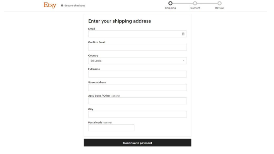
A prime example of a good checkout process is Etsy. They only have three steps for the customer to follow before their order is confirmed. This ensures the process is quick and simple—leaving no time for any last-minute change of plans.
2. Include progress indicators during checkout
Progress indicators do exactly what they say —they indicate how far through the process customers are, and how long they’ve got left.
As you can see in the above screenshot of Etsy’s checkout page, progress indicators are added to the top right-hand corner and labeled: delivery, payment, and review.
These payment progress bars can often be encouraging to customers, especially when checkouts are short and simple. In fact, 20% of people said their main reason for abandoning a purchase was down to a long and complicated checkout process.

3. Be clear and transparent on all costs from the beginning
Transparency about costs is critical when it comes to users checking out. They’re ready to make payment for their order but suddenly there’s an extra shipping charge or fee added on that they weren’t made aware of prior.
This can affect the user’s experience and result in customers deciding against finalizing their purchase. Be clear about costs, adding in the relevant shipping costs and fees incurred right from the get-go.
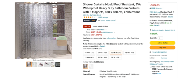
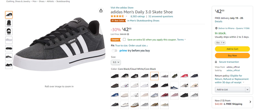
Amazon does a good job of doing this, showing exactly how much the shipping is on top of the cost of the product before customers have added it to their basket.
4. Make it easy to navigate to the checkout or basket
It’s useful to be aware that not everyone who shops online is going to be proficient when it comes to using your website. It’s beneficial to consider how easy the purchasing process is for customers at varying levels of online proficiency.
Get someone who has never visited your site before to test how long it takes them to get to the checkout page. If it’s hard for them to find it, your web design and layout might need some restructuring.
Sites like Amazon will have the basket in the top-right hand corner clearly displayed and others will include a basket pop-up on the left or right-hand side of the screen which will remain there until the user is ready for checkout.
5. Provide the option for guest checkout
Some users will be happy to create an account as part of the purchasing process—especially if there’s some sort of reward for doing so. Others, however, would prefer to complete their purchase as quickly as possible using a guest account.
To cater to all customer types, it’s essential to provide both guest checkout options and an account creation option. Forcing users to create an account can put people off and result in fewer purchases from new customers.
Allowing guest accounts enables you to play the long game by facilitating a great first experience that doesn’t force users to share all their details. Making things easy the first time—from navigating your site to simple checkout—encourages users to return and potentially solidify their relationship by opening an account.
6. Use trusted payment providers
The payment providers that you offer are a key indicator to consumers of your reliability and security. Using unfamiliar payment providers can cause customers to worry that they’re not dealing with a legitimate business.
Consumers don’t easily trust the brands they use, but the effort is worth it—36% of people say they’re more likely to engage with brands they trust. The vast majority (81%) say trust is a deciding factor when it comes to making a purchase.
So, when it comes to payment providers on your checkout page—make sure they’re highly reputable and trustworthy.
7. Deliver several payment options for the customer
Talking of payment providers—you want to offer a wide array of payment options. Credit cards (69%) and debit cards (68%) continue to be the most popular payment method, but digital wallets (62%), mobile wallets (47%), and Buy Now-Pay Later (28%) are catching up.
Some of the most popular nowadays to use are; Paypal, Bank Transfer, Credit Card, Klarna, and Clearpay to name just a few. A diverse array of payment methods gives consumers more flexibility and enables more customers to complete their transactions.
8. Offer quality product images and content
To reduce cart abandonment, it’s important to consider the quality of your product images and the relevant content you use to help sell the product. After all, an image or video of the product is a lot more engaging than just a block of text describing the product.
Many ecommerce sites are getting more creative in the standard of sales advertising they provide when it comes to physical products. Some use interactive features like 360° views to video footage showing how to use the product in question.

ViSenze tip: Help customers find exactly what they’re looking for—and what they didn’t know they wanted—with AI-powered product discoverability tools to help you increase your average order value by 15%.
9. Add product thumbnails to the checkout page
Customers who are adding their products to the basket without much thought may find themselves wanting to review the checkout cart before they proceed to pay.
Having product thumbnails reminds users of what they love about your product—it’s likely not the product name and description. Including product images helps seal the deal when it comes to the final purchase, and helps lessen the likelihood of customers having a last-minute change of heart.
10. Provide an advantageous returns policy
The returns policy is one that often stops some businesses from converting online browsers to online shoppers. If you’re expecting the customer to pay for their return or your return procedure is complicated, they’re more likely to drop off and look for a better alternative elsewhere.
Be transparent when it comes to shipping costs before paying and consider offering an advantageous returns policy that they won’t want to walk away from. Whether that’s free returns or easy drop-off/collection options, it all influences the buyer’s decision to go through with their purchase.
11. Audit the website’s user performance
It’s a good idea to look at how well your users are responding to the website. User experience is key for customer satisfaction—whether it’s their first time on your site or their fiftieth.
Heat mapping, for example, is a good way of understanding where on your site, your users are spending the most or the least time. It can help you identify at what point users are abandoning their carts, and enables you to rectify any problematic UX design.
12. Provide ecommerce personalization for shoppers
Eight in ten customers are willing to pay more for a better customer experience, and 80% of shoppers say they’re more likely to buy from a company that offers a personalized experience. Put simply, offering a personalized ecommerce shopping experience encourages users to complete purchases—not forget them in a basket.
Tailoring each shopper’s experience using AI-powered ecommerce personalization helps ensure your customer find exactly what they’re looking for, every single time. Satisfied shoppers don’t abandon carts—uncertain ones do.

For example, smart recommendations can turn a quick purchase into a shopping experience by showing customers relevant product suggestions. These are ‘You May Also Like’ suggestions for similar products that the customer might like depending on what’s in their basket.
This feature gets your customers more excited about their purchases, and you’ll likely find them racing to the checkout with more than they originally planned on buying.
13. Offer discounts and promotional codes on abandoned carts
Discounts and promotional codes are an effective way to combat permanent shopping cart abandonment. It’s a great way of encouraging shoppers to finalize their purchase following a shopping cart abandonment.
As a strategy, it is not only great for helping with shopping cart recovery but it’s also useful in building a stronger relationship with customers.
You should include the discount/promo code and display the new amount with the reduction applied to simplify the decision for customers.
14. Implement live chat services
Live chat services are a great way to improve the customer experience—which is key considering more than 65% of people nowadays have higher expectations for customer service than they did three to five years ago.
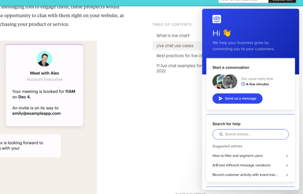
Live chat services can help answer any concerns or queries the customer may have which could be preventing them from checking out fully. It’s a quick and easy way for consumers to put any doubts they have to rest and continue with their purchase.
You could also consider providing better self-serve support options to consumers—such as well-placed tooltips or a comprehensive knowledge center. Anything that helps users understand your site and products better is a win.
15. Use email retargeting for recently abandoned carts
Email retargeting is a great way to encourage users to recover abandoned carts. It might be that the user needs a little bit of extra encouragement or convincing to go through with their purchase, and your email could push them towards the final checkout.
It’s been proven that email retargeting works well when it comes to converting more users into customers—44.1% of abandoned cart emails are opened and almost a third of clicks on these emails (29.9%) will lead to a recovered sale.
Retargeting emails is a good way to re-engage customers and remind them of what they’re missing out on.
16. Add a ‘save for later’ button
Often, customers leave items in their cart with the intention of returning to complete the purchase. The option to ‘save for later’ enables them to save their shopping carts without you having to indefinitely hold back stock.
It improves the user experience by enabling customers to save their carts without fear of returning to an empty cart and encourages users to only use the cart when making a purchase.
17. Enable one-click shopping
One-clicking shopping helps customers complete a transaction quickly. It reduces the steps to purchase and generally helps improve sales for the business as a result. There’s no shopping cart abandonment if there’s no shopping cart, right?
For example, Amazon allows one-click shopping. It enables users to order a product without even having to send it to the checkout basket.
What is a good shopping cart abandonment rate for ecommerce?
There are lots of numbers floating around when it comes to ecommerce averages for shopping cart abandonment. However, you’re looking at about 65-70%.
This, of course, varies by industry:
- Finance: 83.6%
- Non-profit: 83.1%
- Travel: 81.7%
- Retail: 72.8%
- Fashion: 68.3%
- Gaming: 64.2%
You’ll also find that shopping cart abandonment rates vary by product. For example:
- Clothes: 40%
- Tech: 18%
- Home: 16%
- Jewelry and accessories: 6%
- Food: 4%
- Fitness 2%
These averages provide a good benchmark for you to compare your own shopping cart abandonment rates.
Wrapping Up on 17 Strategies for Reducing Shopping Cart Abandonment
Identifying your customer’s pain points during the purchasing experience is the first step to resolving them. This will subsequently lower your shopping cart abandonment rate as well. These 17 strategies help you ensure customers are completing their purchases—not heading elsewhere.
If you’re looking to create a better shopping experience for your customers, consider how ViSenze’s AI-powered product discovery and recommendations can improve your ecommerce business. ViSenze’s unique software enables you to create richer, SEO-informed product catalogs, as well as shopper-specific product recommendations on your site.
Get in touch and request a demo. Experience how product discoverability can help you do more for your customer’s experience.
Shopping Cart Abandonment FAQs
How to handle abandoned carts?
The main goal when handling abandoned shopping carts is to encourage cart recovery. This consists in applying strategies to invite users to complete their purchase, whether that’s discount codes or targeted re-engagement emails.
Another way you can handle shopping cart abandonment is by avoiding it together. You can do this by improving the functionality of your online store through improved product discovery and UX design.
Why do people abandon their online shopping carts?
There are multiple reasons why a person might abandon their online shopping carts. This includes:
- Lack of payment options
- Website crash or error pages
- Concerns about payment security
- Long and complex checkout process
- Not wanting to create an account on the site
- Extra costs for shipping that weren’t mentioned initially
Hence, identifying the issues your customers face is key to reducing shopping cart abandonment rates.
How to avoid shopping cart abandonment?
To avoid shopping cart abandonment, it’s important to provide a great user experience. You can do this through improved product discovery, more transparent pricing details, and a simple checkout experience for customers.

